PlanMember
Technology has already altered the financial market forever. Among traditional financial organizations, 82% plan to increase collaboration with fintech companies in the next three to five years. Consumers demand a seamless digital experience when handling their funds. Financial companies must work to provide this for them or risk losing out.
Contemporary expectations can only be met with the best technology. Think about it. Would you do business with a bank that didn’t have a website or offer a form of SaaS? It’s that simple and yet there are still financial institutions like this that exist.
The organizations that put customer needs at the forefront of strategies are those that win the prospects and keep them. Here is where PlanMember was able to find market fit. We offer a SAAS to independent financial institutions. Through PlanMember, they are able to manage all of their individual clientele, groups, new enrollments and rollovers through one online platform.
Overview: Platform that allows Financial Representatives to manage their clients
Role: UX/UI Design, UX Research
Software: Figma, Wrike, Xtensio, Miro, Whimsical, SurveyMonkey and Zoom
Product: Complete overhaul/redesign of a SAAS Platform
Timeline: 9 Months

I believe in financial retirement. I don't necessarily believe in physical retirement.
— Jerry Doyle

The financial services industry…
The global financial sector is expected to be worth US $26.5 trillion in 2022 with a CAGR of 6%.
64% of consumers worldwide have used one or more fintech platforms, up from 33% in 2017.

The Problem
A financial professional who wants to manage their clientele, often finds themselves overwhelmed and frustrated at how difficult it can be and how time consuming it is to manage their book of business and they need to find a way to effectively manage/navigate it.
Phase 1: Understand
Stakeholder Meeting
Several meetings were had discussing the need to overhaul the current platform. The original design was done about a decade ago and has only been added to since. They laid out the requirements which were to redesign PlanMember.com into a multi-experience website (client and prospect) and to better engage our clients through their client account access experience and increase engagement, loyalty and AUM. I had 8 months to redesign the platform from end to end and along the way create a new design system and design processes for the company.
User Interviews
The users were provided with a consent form, conducted over Zoom and took place within the span of 14 days. The interviews were conversational and in-depth. Prioritization was placed on making the user feel comfortable and open. You can find the main insights below.
Several were excited at the aspect of having more technology at their fingertips
Most expressed caution and concern about it possibly making their work more difficult
The main user flow was from the dashboard over to BusinessConnect to add new business.
User Survey
A survey was also sent out to over 1,000 clients. Below are the key findings:
The main action they take is uploading forms and adding new business
Nearly 40% have used paper forms to avoid the online experience
Almost all Financial Representatives want an easier way to onboard
There are significant information gaps in knowledge about the current website
I grouped similar ideas and statements to help distill themes.
Conclusion
After conducting the interviews and survey it was clear that we needed to make sure that it was extremely intuitive and will be able to minimize the users cognitive load. I wanted to ensure that it had more consistency throughout the website so it can instill more trust with the product. I noticed that most clients use the product for only a few things.
Market Research
Lets take a look at the closest competition…
Vanguard
Clear path to task
Visuals used to illustrate
Consistent design across platform
Edward Jones
Dedicated location for brokers
Online tools to help enrollment
Visuals used to illustrate
Fidelity
Highest client happiness
Consistent design across brand
Visuals used to illustrate

Our Current Client Journey

Using google analytics I was able to see a problem almost instantly. A large number of users will log in and then churn out right away.
Heuristic Evaluation
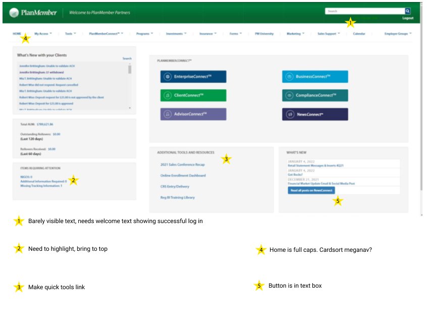

Pain Points
Unclear site navigation
Huge falloff following the first log in.
Consistency and design standards
Different pages have a completely different design, causing the user to get confused and trust the brand less.
Complex steps the user needs to follow
In order for the client to do anything they have to jump through unnecessary hoops.
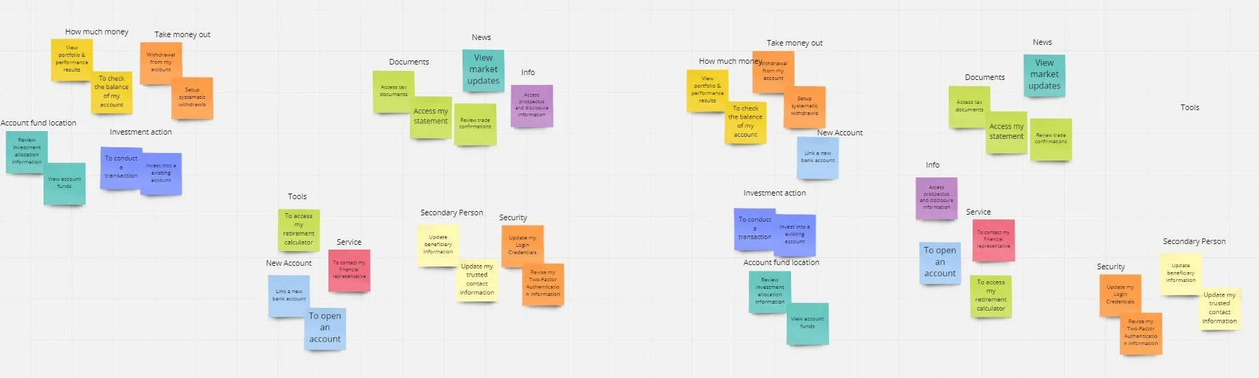
Finding Our Target Audience

I found two different hotspots within our users. Those aged 40-55 and 60-69 with accounts in the 3 and 6 amount range.
Persona

WHAT IS A PERSONA?
Although personas have become more debatable in recent times. I believe they can still help serve a purpose. While it should be used as a supplementary research tool and not a heavily relied upon one. Personas help to not only create a vision of your user but help to formulate needs, wants and frustrations. They are based on behaviors and motivations of real people we observe or data gathered from actual users encountered in ethnographic interviews. They help to maintain alignment with all members of a team on a website or digital project. They serve the purpose of helping to orient a project and can be used to help make informed decisions when user goals are called into question.
John Jones
As we can see here the persona created is named John. He is a local small business owner who opened a shop about 8 years ago. All the effort and time he has put into his business has finally started to pay off. He wanted to continue growing his book of business but is struggling to do so now. His business has grown to the point where managing it is taking more time then sourcing new business
He Doesn’t have much time to spend on researching so he wants to spend as little time as possible doing paperwork. However, due to the time constraint he has a very short temper with people wasting his time.
Phase 2: Define
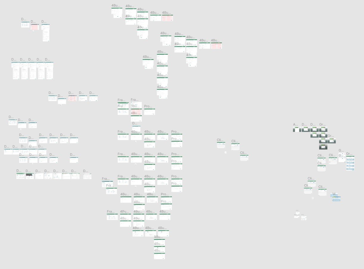
Current Site Map
I’ve laid out the basic structure of what the platforms layout is. As you can see it is extremely dense right now. The main focus now should be on simplicity and ease of use. Utilizing the users mental model on traveling will help to minimize any unnecessary friction points while navigating the app.

Finding The Ideal User Path
Future State Journey map
The customer journey maps gives us a visual perception on not only where the frustrations lie in their user journey, but also how they are reacting to their frustrations and what methods of resolve they try to accommodate to improve their own satisfaction. In this journey map, you can see how the user goes from unhappy and frustrated to understanding and happy once they go through the upload.

Ideal user journey to onboard a new client.

Future User Flow
Here you will see the ideal user flow created with the options that the user might incur along the path onboarding a new client.
Phase 3: Justify the Need
Target Audience & Basic Need
Demographics
Ages 40-69
Financial reps and account managers
Behaviors
Uses current platform to upload client information
Is focused on increasing time efficiency
The opportunity

Once logging in the user will now go directly to the dashboard. Modals will now be easy to close or ignore.
Untapped Potential
The retirement of Baby Boomers in the financial advisor industry is creating a need for new wealth managers in the younger generations. 56% of industry professionals are age 50 or above for the industry right now, compared to just 5% who are under the age of 30.
Generations X and Y are expected to accumulate roughly $46 trillion in assets by the end of 2020, which includes $18 trillion in inheritances from their parents who were Baby Boomers.
This is a perfect time to redesign a platform to better suit the younger generation of future financial professionals.
Phase 4: Design

Paper Prototype
During this phase we are able to put pen to paper so to speak. We are going to start creating low fidelity prototypes, making decisions on information architecture, iconography, color and typography. Then progress to mid and finally high fidelity mockups. All while validating and testing through user feedback and user testing, making sure to pivot when necessary.
Mid Fidelity
Mid fidelity wireframing is used to help showcase your design architecture without the worry of color, icons and other UI elements. This is a great time to share your thoughts and collaborate with engineers to get their ideas and concerns as well. When the design handoff happens they should be very familiar with your designs. The goal is to have it translate to a high fidelity design that will both be easy and quick for the developer to build.
Deciding on UI
Typography

Color palette

CTA buttons

All Iconography was updated
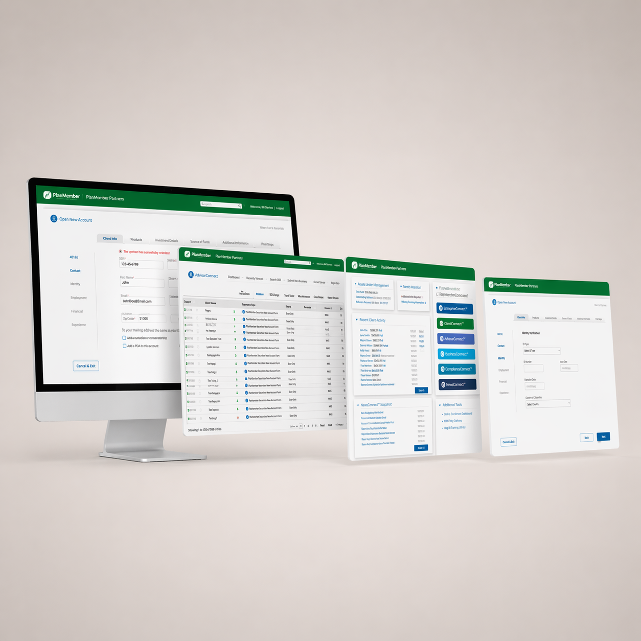
High-Fidelity vs old
After compiling the main designs through paper and wireframes, I set out to create an interactive prototype fully built out for user testing. My main goals were to keep it clean and simple with a decent amount of white space and a logical flow of design. I wanted to anticipate and provide the user with the tools they needed to succeed in their main goal in a logical order. The key was to follow the users already formed mental model on enrollments.
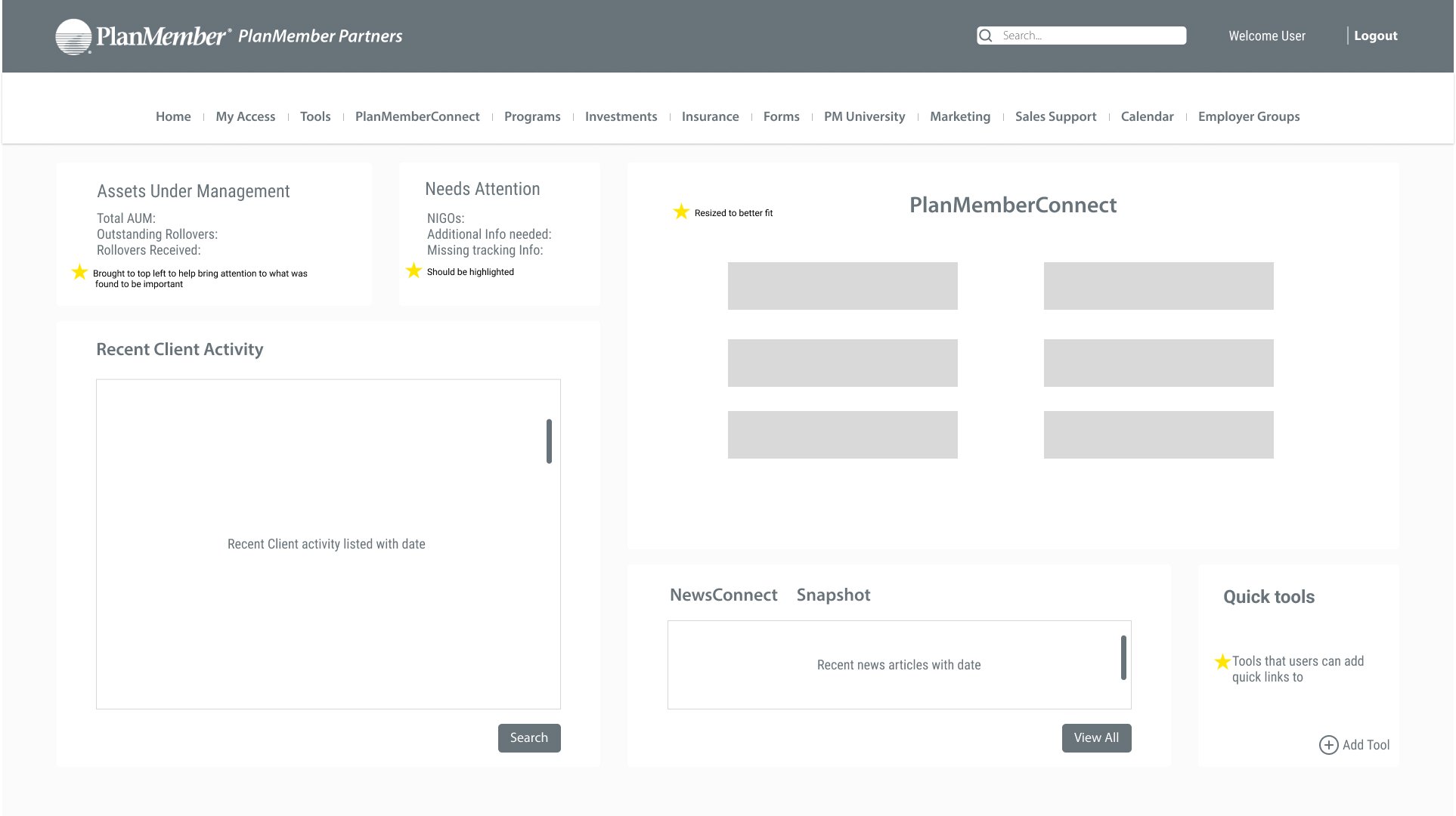
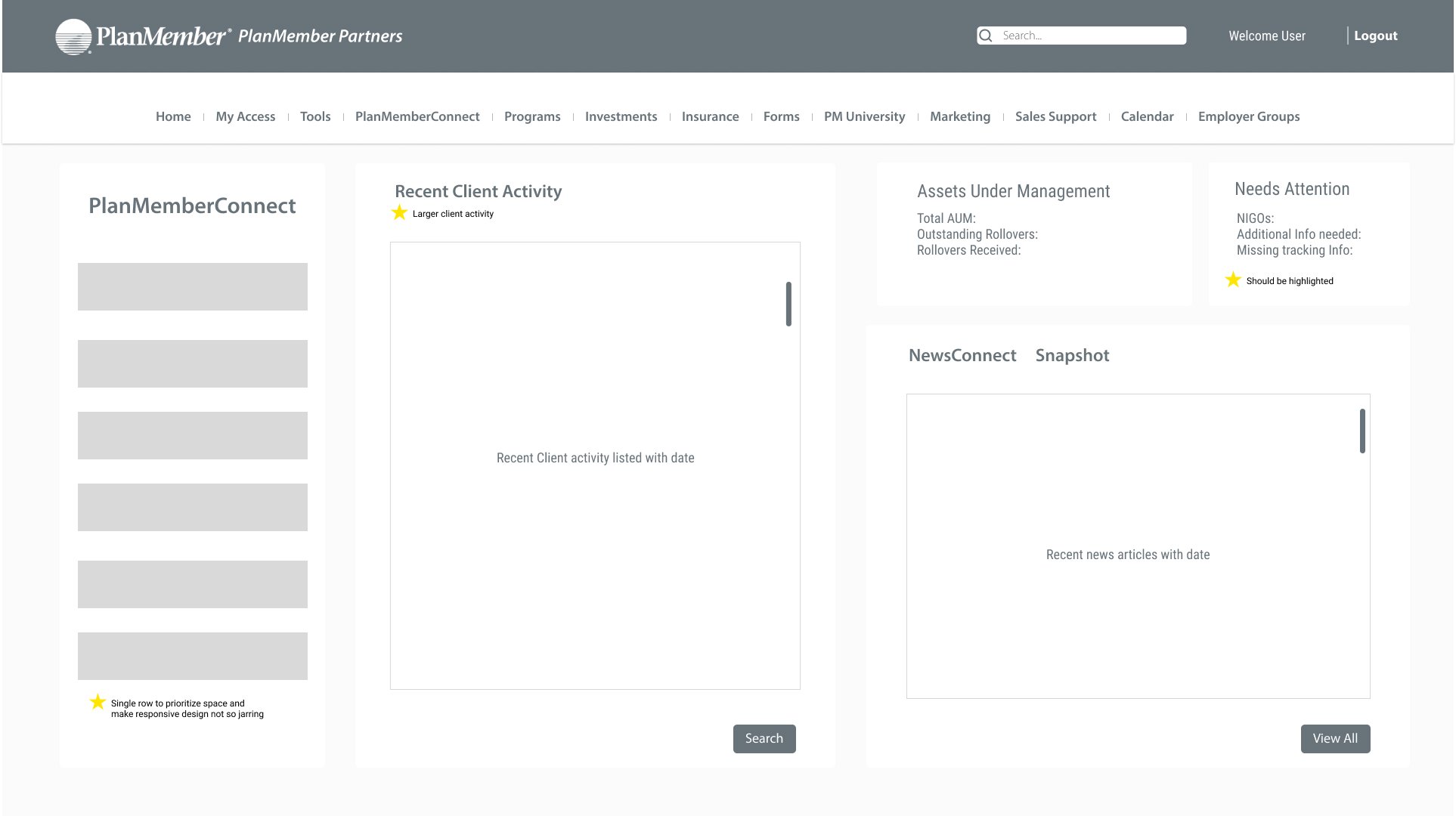
Dashboard

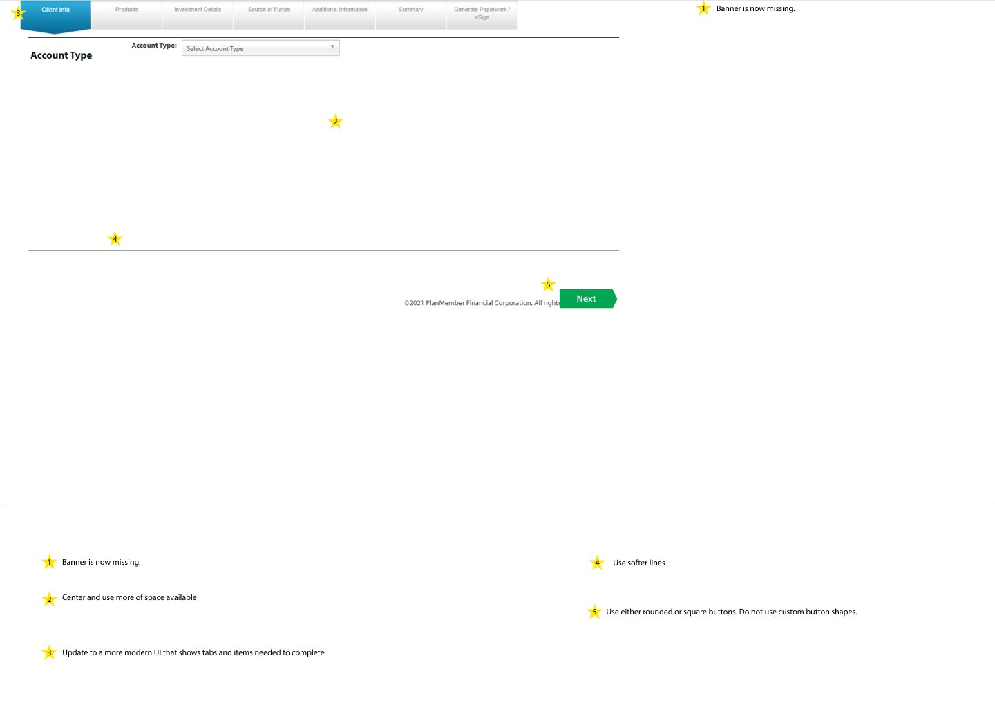
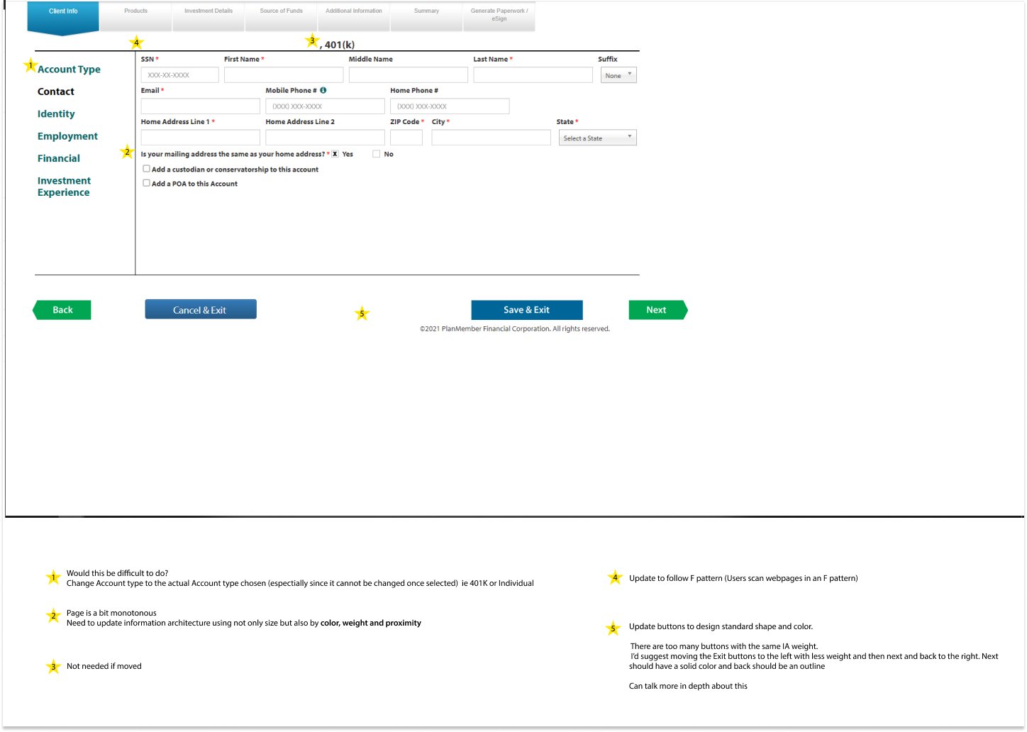
Old design

New design
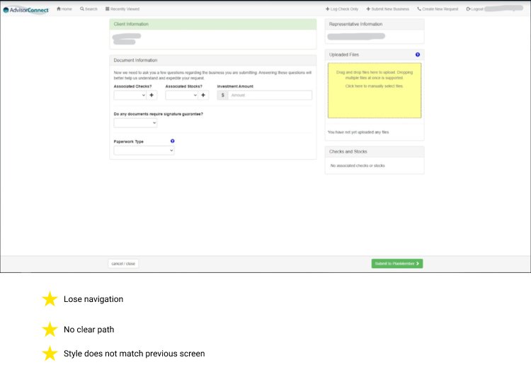
BusinessConnect

Old design

New design
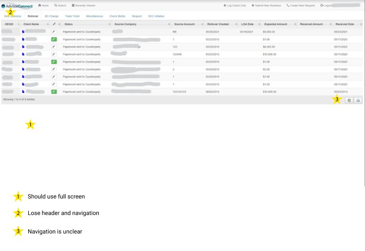
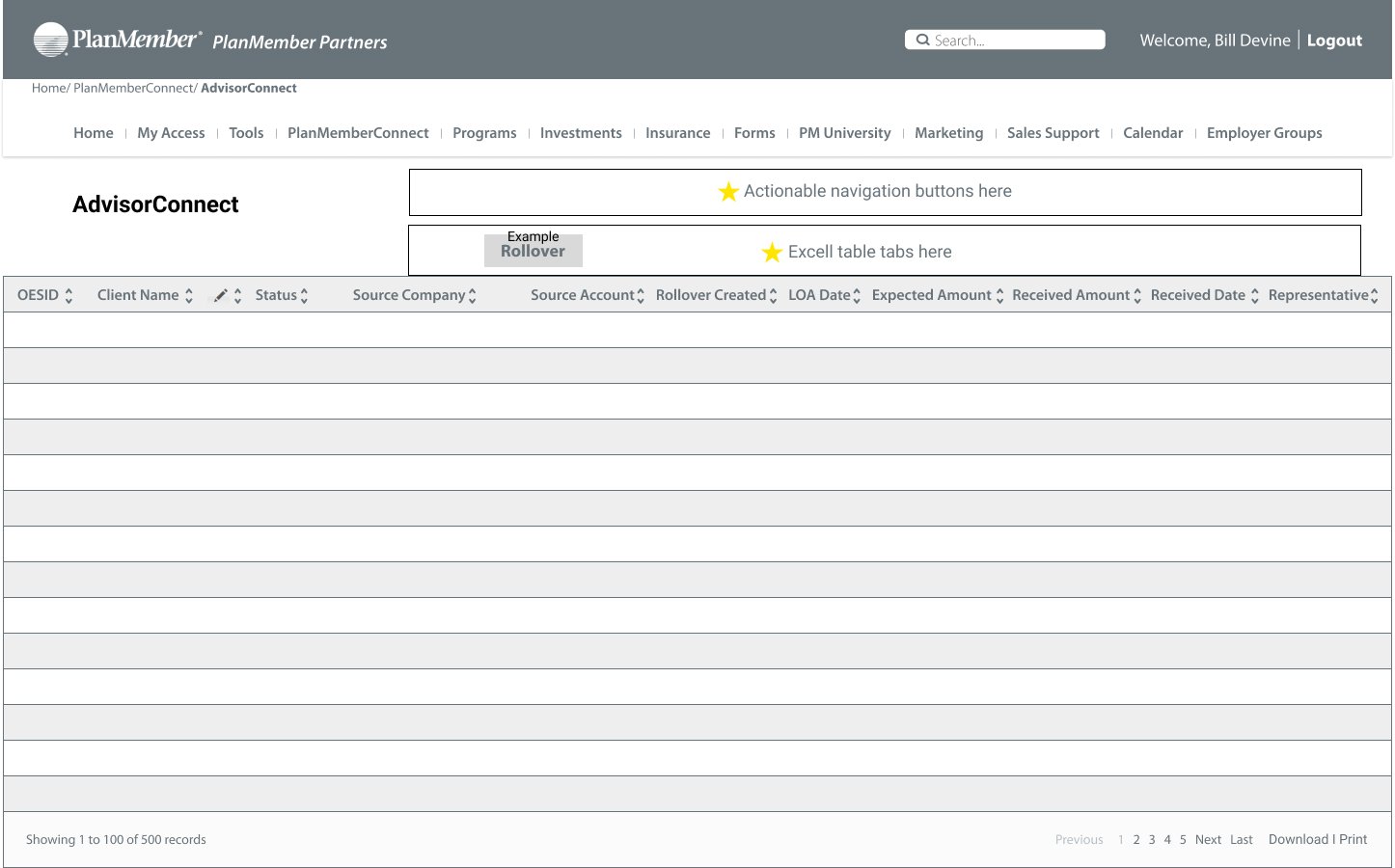
AdvisorConnect

Old design

New design
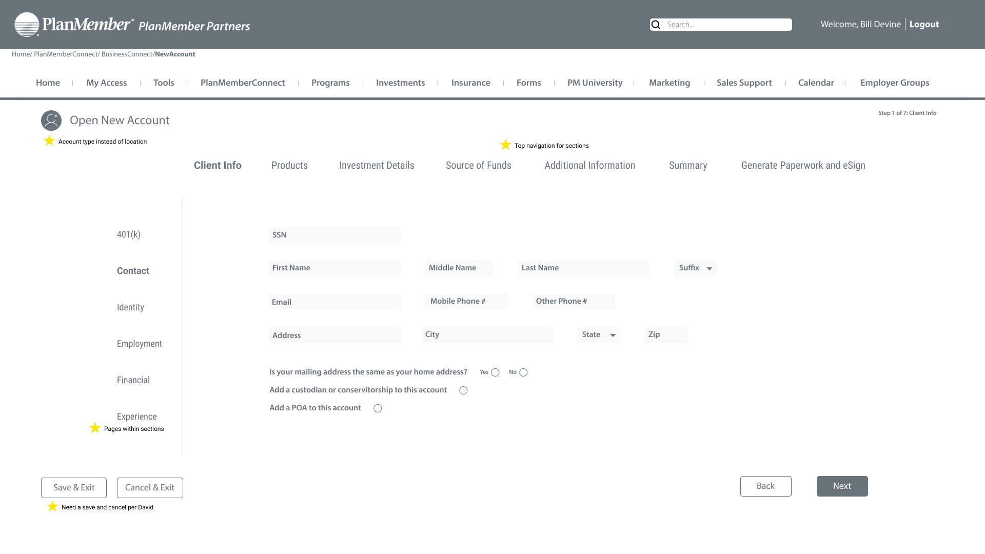
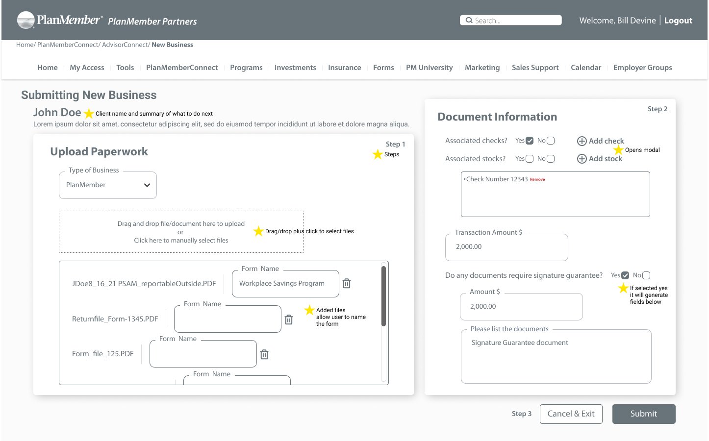
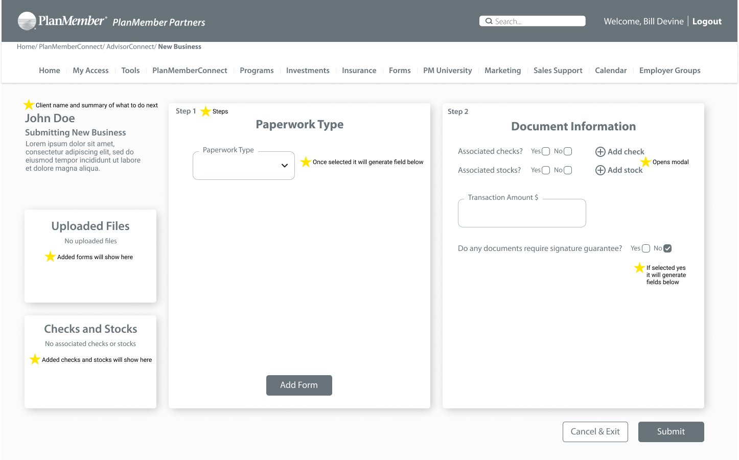
newbusiness (advisorConnect)

Old design

New design
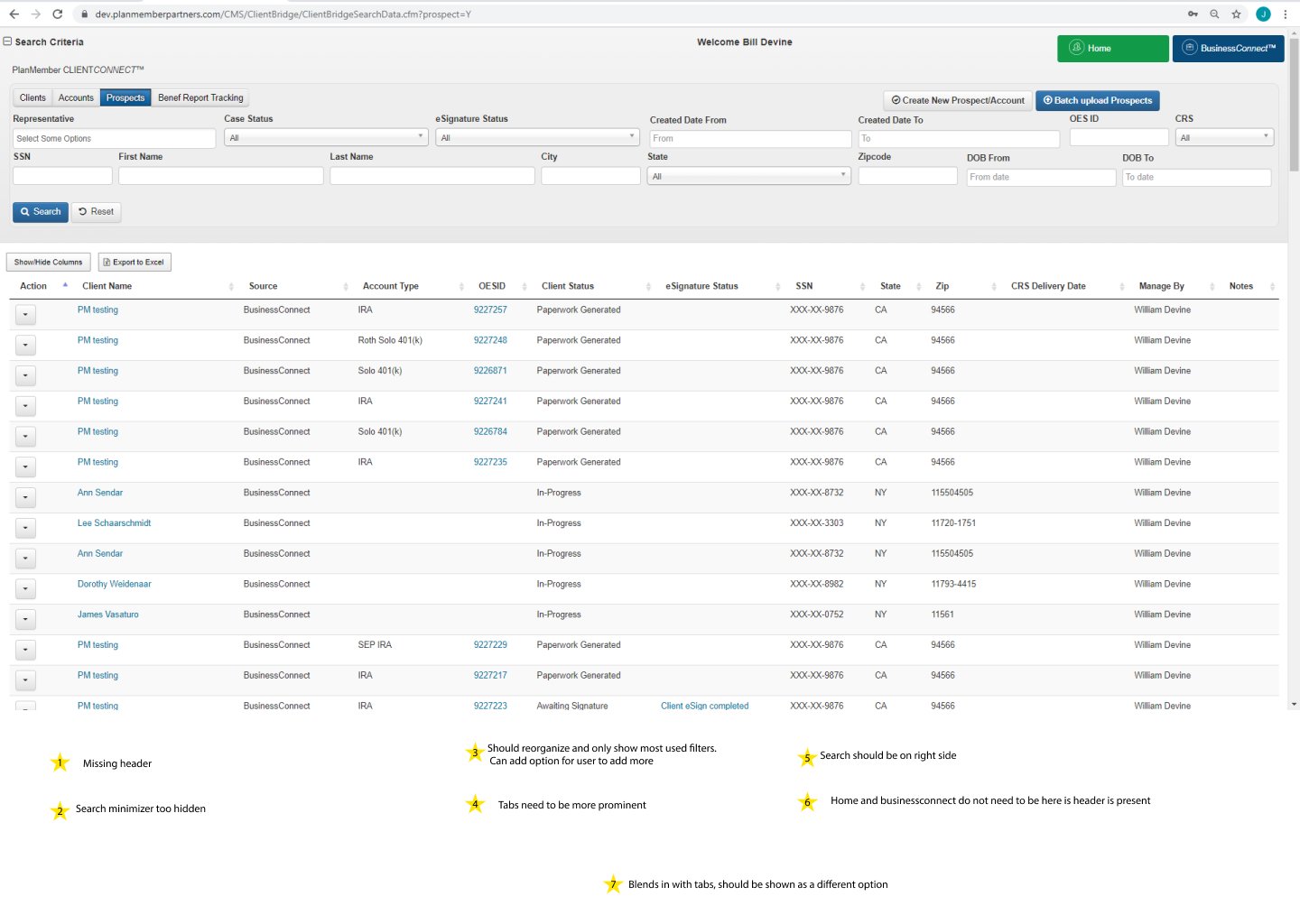
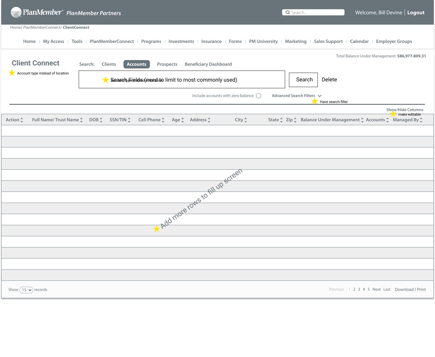
ClientConnect

Old design

New design
Phase 5: Ideate and Validate
visual Testing

Responsive tablet dashboard design
A/b Visual testing
A/B visual testing was competed at this stage and was shown that users preferred the informational layout of the new screens. Recognition and recall of certain features were improved by an average of 42%. Meaning that when shown an image of both the old and new design for 15 seconds. Users were able to more accurately place and describe the UI of the platform.
User Testing
Once the first iteration of the high fidelity prototype was completed, a round of user testing was conducted using three new users. They were asked to complete a set of simple tasks which included logging-in and locating how to submit new business, finding out if a submission was approved and locating if any of their clients are NIGO (not in good order).
Some key insights were
Task to time had an improvement by over 1:30 seconds on average
The number of clicks was decreased by 25%
Exit interviews concluded that all three users preferred the new design.
Final thoughts and Prototype
Outcome, challenges, reflection and over 160 pages of designs/ iterations later. I believe PlanMember finally has a solid footing in which it can build off of.
The world is moving forward with tech at an incredible pace, especially in the financial space. Technology is now expected at every turn to help improve the lives of your user. And if not done right, or constantly iterated on, you could miss out.
Thanks for reading all the way down! Make sure to check out the app using the link below!