

Town Square
With the recent rise in home gardening, there is a need for a product that could help facilitate the trade or sale of excess produce. An individual with a garden or mature fruit tree, often feels overwhelmed about having too much of the one type of produce. Town Square aims to fill this market by creating a virtual farmers market or city center for neighbors to trade produce.
Overview: MUXD Masters Capstone Project
Role: UX/UI Designer, Researcher and Facilitator
Software: Figma, Azure, Photoshop, Whimsical, Uxpressia, Miro
Product: Mobile iOS Design
Timeline: 8 Weeks

If you can’t afford to buy organic, then you should grow organic
Each year the average gardener spends around $70 on their hobby and harvests over $600 worth of food.

A growing industry…
This past year 1 out of every 3 U.S. households now grow their own food.
However, they also throw away an estimated 25% of the food they harvest every year.

The Problem
An individual with a garden/fruit tree, often feels overwhelmed about having too much of the one type of produce and needs to find a way to give or trade for another type but faces no easy way to do so past their friends and relatives.
Phase 1: Understand
User Interviews
The two users were provided with a consent form, conducted over Zoom and took place within the span of 3 days of each other. During the interview 5 basic questions were asked of each participant, with a question branch chain following to fill any void and an open discussion was prioritized. Several insights stood out.
Users wanted a way to not only trade but have the ability to give away some of their produce for free.
More people are open to trading their produce then I first anticipated. Even more than just their excess.
As anticipated, most users I have spoken to about Town Square were very interested only if they had a garden or a fruit tree. All others were not interested.
User Survey
A survey was sent out to 10 individuals who own either a mature fruit tree or a home garden. Below are the key findings:
15 participants resonated better with the name stand over stall, bin, post or marketplace but all wanted a label of “market stand” when on the page.
All experienced an excess of produce each harvest season
There is a typical planting season in spring when most participants will plant their garden, about half of the participants also planted in the fall for winter vegetables.
Only 2 participants already sell some of their produce but all others wanted to be able to but didn’t know where to begin.
Market Research
Has this been done before?
Lets take a look at the closest competition…

No Dedicated app
Directory of CSA farms
Focuses on B2C of produce/meat/herbs direct from farms
No dedicated area for trading of selling local produce

No dedicated app
80 million monthly users
Focus on used items/jobs/housing
No dedicated area for produce

Dedicated app
44 million active users
Focuses on C2C of used items
No dedicated area for produce
Pain Points
Not having a dedicated app or platform specifically made for produce
Currently if you want to trade or get fruit from a neighbor you need to go out of your comfort zone to ask them in person.
If you have an excess of fruit or vegetables you have only a few options
Give it away to friends and family (limited to your network)
Eat it all (can quickly turn unenjoyable)
Let it go to waste

Persona
What is a persona?
Although personas have come under fire in more recent times. I believe they can still help serve a purpose. While it should be used as a supplementary research tool and not a heavily relied upon one. Personas help to not only create a vision of your ideal user but help to formulate needs, wants and frustrations. They are based on behaviors and motivations of real people we observe or data gathered from actual users encountered in ethnographic interviews. They help to maintain alignment with all members of a team on a website or digital project. They serve the purpose of helping to orient a project and can be used to help make informed decisions when user goals are called into question.
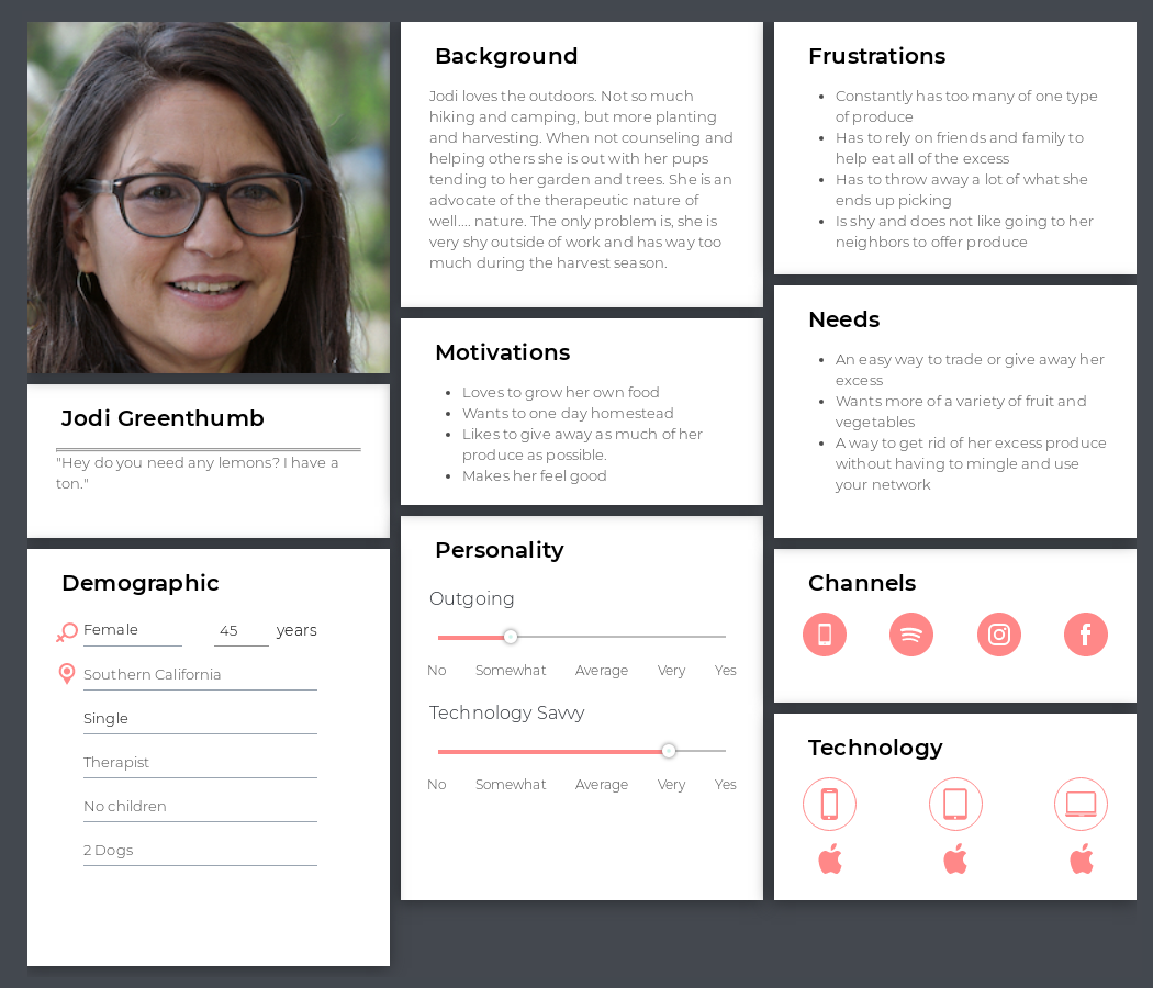
Jodi Greenthumb
As we can see here the persona created is named Jodi. She has a knack for gardening and loves the outdoors. Well not so much camping or hiking, but more planting and harvesting type of outdoors. When she’s not counseling and helping others she is out with her pups tending to her garden and fruit trees. She is an advocate of the therapeutic nature of well.... nature. The only problem is, she is very shy outside of work and has way too much produce during the harvest season.
Phase 2: Define
Journey Mapping & Storyboard
Future State
The customer journey maps gives us a visual perception on not only where the frustrations lie in their user journey, but also how they are reacting to their frustrations and what methods of resolve they try to accommodate to improve their own satisfaction. In this journey map, you can see how the user goes from unhappy and overwhelmed to downloading the app and making an easy trade for more variety of produce.


StoryBoard
The following storyboard depicts two users who own a mature fruit tree. During the harvest season you will see that they are overwhelmed with the amount of produce they have. With no obvious option other than giving it to friends and family they are forced to think of some other way to avoid throwing it out. Luckily one of them mentions TownSquare. With the help of the app, the user is able to post that they have excess produce and are open to trade. Another user in the same community messages back that they would like to trade. They both agree to a time and place, meet up, make the trade and leave happy.
Research Tools Used

User Flow
Here you will see the ideal user flow created with the options that the user might incur along the path of making a produce trade.
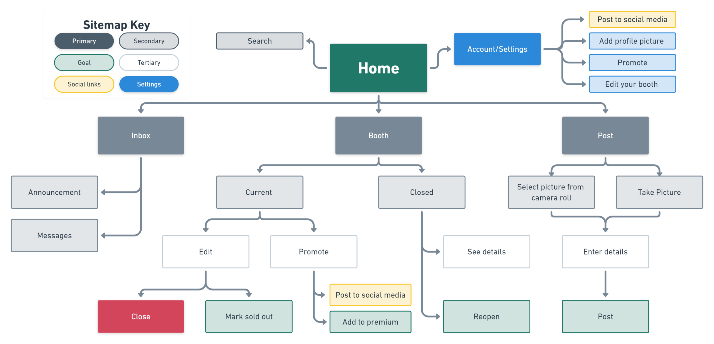
Site Map
I’ve laid out the basic structure of what the platform layout will be. The goal in mind was to focus on simplicity and the already formed users mental model of other C2C websites. This will help to minimize any unnecessary friction points while navigating the app.
Phase 3: Justify the Need
Target Audience & Basic Need
Demographics
Ages 25-65
Homeowners or individuals who like to garden or have access to mature fruit trees
iPhone or Android user
Behaviors
Frequent user of Offerup, Facebook Marketplace or other similar apps
Hobbies include gardening, cooking or they like to go to farmers markets
Who stands to benefit?
Local companies and organizations
Nurseries looking to advertise
Restaurants wanting to buy fresh
Farmers market stalls looking to promote
Users
Individuals looking to trade produce from their garden or orchard
Those who enjoy going to farmers markets on the weekend
The opportunity

Untapped Potential
American gardeners have spent nearly 4 billion on garden retail sales- this is up 20% from just last year.
TownSquare will be taking the same approach as other C2C marketplace platforms such as OfferUp. However, it will be unique because there are currently no other platforms out there that focus on produce trading between communities.
Revenue will be driven by allowing users to promote their posts for a fee and through hosting ads on the platform. This ad and post promotion model works quite well. In comparison, OfferUp’s annual revenue is between 300-500 million and has a valuation at just over 1 billion.
Phase 4: Design
Lo-fidelity
Paper Prototype
During this phase I am finally able to put pen to paper so to speak. Starting with paper is often the simplest and best way to get into a flow. It allows you to hone in on not so many details about color, typography or UI but more of the Information Architecture of the site, the layout and overall feel.


Mid-Fidelity
Wire Frame

Post
Dedicated icon for settings
Highlight how many steps are needed to complete their posting.
Selected photos will be shown here helping the user remember what they chose.
A dedicated nav bar on the bottom of the platform will have Home, Chat, Post and Stand icons with labels.
Filters are prioritized toward the top of the page. Filters such as Sort by and Item type will have a quick select.
Homepage
Items that are nearby and new will be highlighted showing the user that they have a reason to reopen the app frequently.
Large pictures will be shown at the top. This was done due to user testing showing that they prioritized images of what they wanted to trade.
Recommended Reads will show recipes and articles based on the users browsing and trading history. If they post about avocados, trade avocados or look at avocados they will then have a Recommended Read feed of avocados.
Listing
Under the description will be labels showing if the item is in season, a verified user, open to trade, and willing to sell their item.
A large map will show the general neighborhood of where the item was grown or harvested.
On the bottom before the call to action buttons will be a section of similar items. This will help keep the user feeling confident that they have all the information needed about what they want to research.
Deciding on UI
Typography

Icons & State

Color

First Iteration of a High-Fidelity Mockup


Phase 5: Ideate and Validate
User Testing

Iteration
Once the first iteration of the high fidelity prototype was completed, a round of user testing was completed using two of the original users. They were asked to complete a set of simple tasks which included logging-in and locating their profile page, finding and messaging someone selling carrots, posting an item of their own and finding their QR code.
Some key insights were
The overall feel of the app was too dark
The typeface was either too small or the information architecture wasn’t clear enough
The homepage needed to have a clearer filter and to diversify the sections
The QR code was difficult to find
Final Iteration and confirmation with AB testing
Login screen before and after
Icon was simplified
Background was changed to a landscape
Text near CTA to excite user to urge them to sign up
Signing up was given heavier weight over logging in


Homepage before and after
Icons were updated to a more clear tone
A cloud was added to the background image
Filters and sorting options were added to the very top and prioritized
A section called Recommended Reads was added to help break up the monotony of the original design. It also helped to create a reason for the user to revisit the homepage even if they aren’t intending to trade.
Posting an item before and after
Priority was given to selecting a photo button
Only three steps to post an item
Photos chosen are now shown, helping user remain confident in moving forward
Simplified UI of how many stages there are


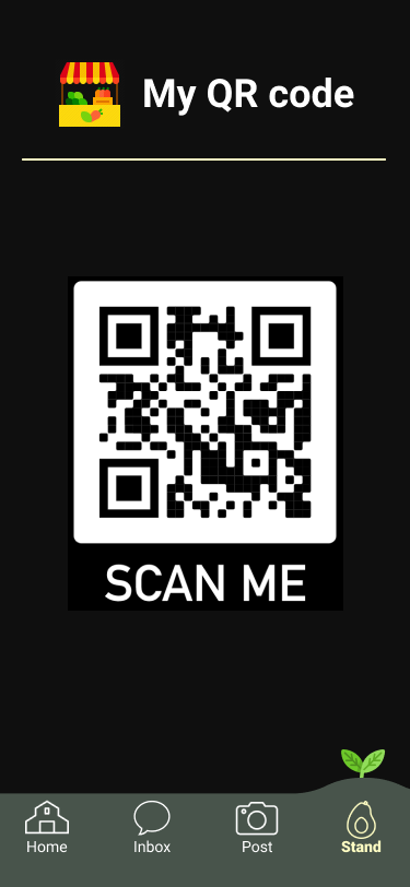

QR code before and after
Screen was lightened due lessen how heavy the page felt
Background was added showing vine growing
Profile page was added to help them navigate back
Code was activated
AB Testing Results
Overall time reduction of 27% for task completion
Error rate reduced to 0%
Clicks to completion reduced by 50%
Resulting in an overall positive design change.
Final Thoughts
Outcome, challenges, reflection and over 60 pages of designs later. This was definitely one of my more challenging design and research projects. From the beginning it was a struggle to find enough data on anything AG Tech or agriculturally related to this product. Because of this, almost all data and research had to be done first hand. With such a short time frame it was essential to keep a schedule and keep as close to it as possible…. and if you’ve ever done anything research or design related, that can be a real challenge.
This project has shown me that there truly is a real need for a “virtual town square” or produce orientated platform. Surprisingly there is nothing out there that does this. The home gardening market is growing at an incredible rate and it is only a matter of time before there is a drastic void that needs to be filled. I believe TownSquare can and will fill that need. Now looking to the future I will continue to be ready to pivot should the need arise while I move forward with the developing stage. But in the end I believe in TownSquare and I believe it will make the community a better and healthier place.
Thanks for reading all the way down! Make sure to check out the app using the link to the right!
